Silly name, serious business. Today we’re releasing a new feature...that has existed for 10+ years: the DevResults Index, as you’ve never seen it before.
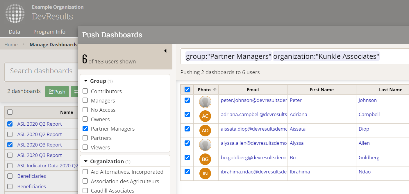
DevResults users have long used index pages across the app — they provide lots of ways to narrow down your search to exactly what you're looking for. We've now adapted other selection tools in the app to match, expanding functionality while streamlining the interface.
Here's an example...
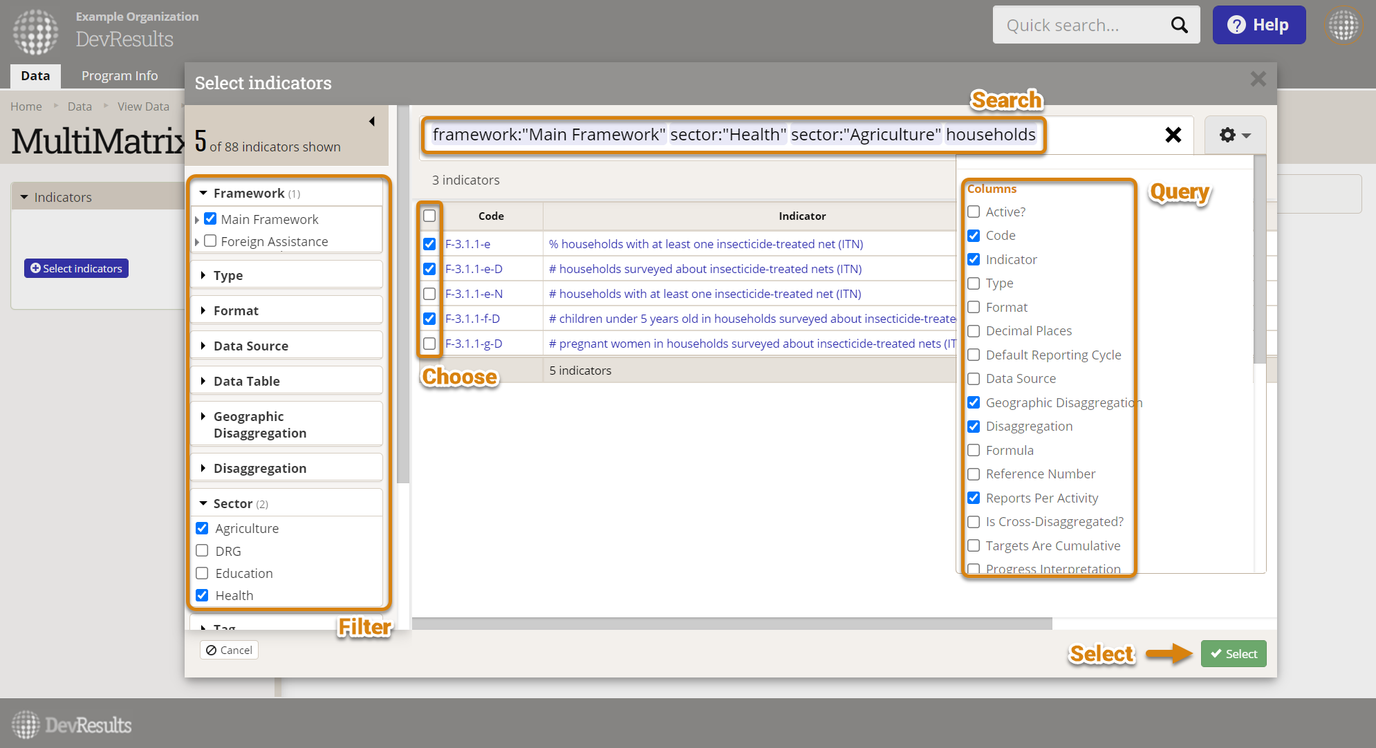
This update puts one of our most robust and versatile selection tools in many new places, replacing other less-powerful selection tools, including:
- Selecting indicators for a MultiMatrix report
- Pushing or changing ownership of dashboards
- Adding indicators to one or many projects, and vice versa
- Adding users to one or many projects, and vice versa
- Adding reporting periods to a project
More importantly, we’d like to share how we got here.
The Backstory
Building a user interface (UI) requires creativity, invention, experimentation. We spend most of our time thinking up, drawing out, and talking through various ideas, only a fraction of which actually make it to our app. Sometimes we put a few different UI ideas out there to see which work best.
Case in point: how should users choose one thing to be added/linked/assigned/mapped to another thing?
Experimentation 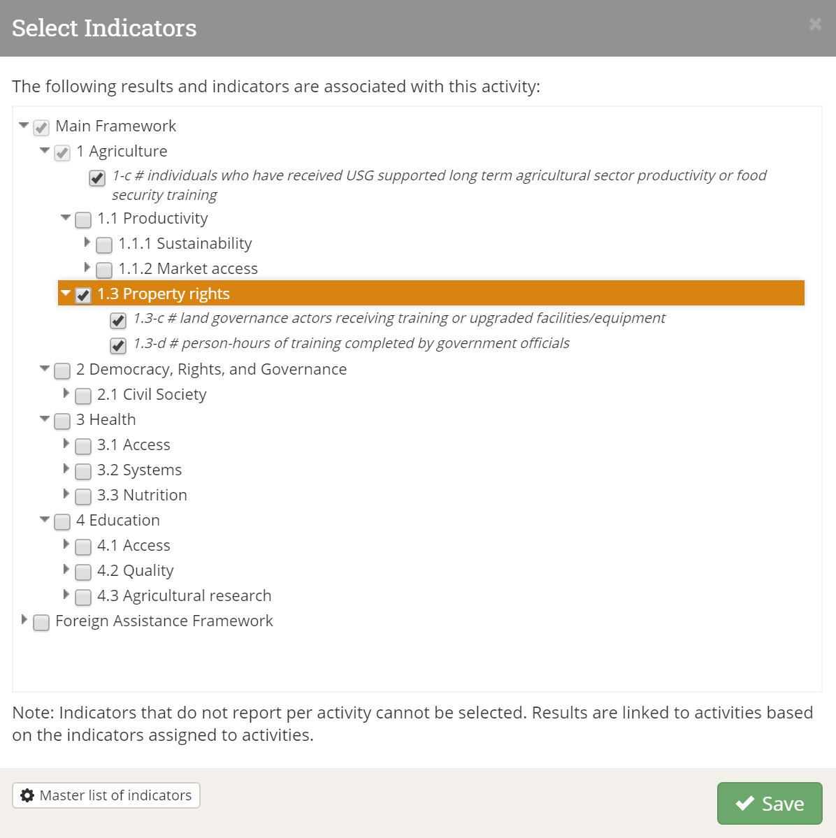
Let’s say you’re adding indicators to a project. What’s the most intuitive way for someone to find a handful of indicators from a giant list? Well, most people tend to think about indicators as they relate to results frameworks (aka logframes). We see this all the time in spreadsheets that clients send us, with results and indicators tied together. Makes sense! Behold, the “indicator chooser” was born:
Elegant, intuitive, straightforward, no? With this pop-up, you could:
- “Select all” by ticking an entire framework, full of results and sub-results and linked indicators
- Pick and choose your results, and in the process, grab all nested indicators
- Expand your entire framework, and select individual indicators one by one.
That made sense for a long time. But over time, we noticed users asking questions that this UI pattern couldn’t answer:
- How do I select all indicators with a particular tag?
- How do I search for an indicator name if I don’t know the result it’s tied to?
- Why can’t I find an indicator that I know exists? (Spoiler alert: because it isn’t linked to a result, and therefore, will not appear in a result-based list like this.)
We had many other patterns for finding and linking other things.
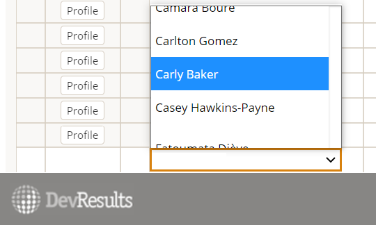
Let's say you wanted to assign a user to a project. How about a dropdown menu? Better yet, a dropdown you can filter by typing a couple characters? That’s great...until you find yourself with 100s of users to assign to dozens of projects, one by one. Or you can't remember someone's first name, but you know which organization they're with.
Sometimes the simplest solutions are not always the best when dealing with complex linkages.
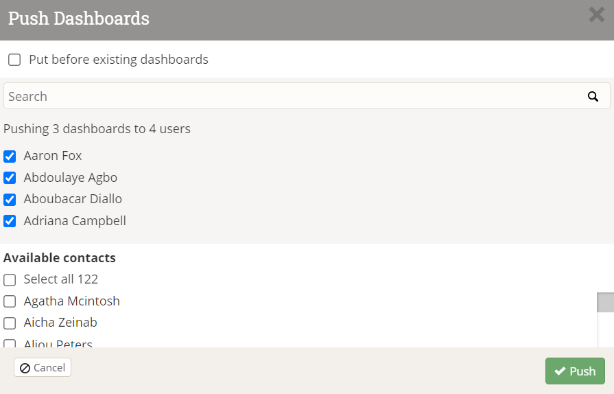
What if you wanted to push some dashboards to several users at once? Once again, we need to select a few key users from a much longer list.
How about a checklist with a search bar and a “select all” option? That's slightly better than just an alphabetized dropdown...except when you want to find just partners, or just users from a single organization, or, or, or,...
Once again, it just isn't possible to give users all the options they need to make complex queries with the standard UI tools that are out there like dropdowns and checklists. Worse, it's slightly frustrating to offer users a very capable query tool in one place, but not everywhere else.
The thing is...these are all solved problems. Despite all of our experimentation with different UI patterns and tools and ‘choosers’, the one that consistently beats them all is the one users are most familiar with: the humble Index.
Indexification
DevResults index pages are simple but powerful tools for filtering, searching, bulk editing, querying, and ultimately choosing things like projects, indicators, reporting periods, users, and more.
Instead of continually reinventing the wheel, we decided to use our most popular ‘chooser’ everywhere it could possibly go. Need to add an indicator to a project? Here’s the indicator index. How about a reporting period? Reporting period index. Users? User index. So on and so forth.
 We hope — and our awesome beta testers have so far confirmed — that this will enable users to find things easier and faster. But the benefits don’t end there.
Consolidation
While experimentation can help you learn what is the best way to do something, the ultimate goal is to consolidate everything you can on that one best way.
This benefits users (🖱️) and developers (💻) alike:
🖱️ We’re busy people. We like consistency. When something is unexpected, it’s disruptive.
💻 We’re busy, too. We like to stay D.R.Y. — that means we’d prefer to provide the same value while writing and maintaining less code.
🖱️ Our colleagues are also busy. When there’s an existing template or pattern, it means we have to do less training.
💻 Hard same! When we onboard a new teammate, it’s easier for them if they only have to learn one way of doing something, not fifteen.
🖱️ We don’t like bugs. When something breaks, we can’t move forward.
💻 Ew, bugs are the absolute WORST. The fixes are not always obvious, and they can really derail your day. The less "surface area" (roughly, lines of code) our app has, the easier it is to exterminate those pesky little critters.
We hope you enjoy using indexes on all your choosers. If you have any feedback for us on this or anything else, don’t hesitate to get in touch at help@devresults.com!