As most of you know, we're a small but dedicated group of people, and we are constantly working to improve DevResults, but we know you don't always find out about those improvements right away. We're working to change that by communicating medium and major changes to you on this blog. In the last few weeks, here's what we've been up to:
1 New default messaging behavior for Activity's submission/return/approval of indicator performance data
We've heard from a number of clients that our existing approach to this--that all users at the assigned Partner Organization get notified whenever data is submitted, returned, or approved--was clunky and awkward. So we've overhauled this to give you more control. From now on, the only people who will receive notifications when an activity has submitted data for a reporting period--or if that data has been returned or approved--are:
- All users included in the Staff Roles and Partner Access section of the Activity Overview tab.
- The Primary Contact assigned in the Partner Organization section of the Activity Overview tab.
- All users who participated in the Discussion for that Activity's Reporting Period.
There aren't obvious changes to the site here, but if you rely on these notifications, you'll want to go through and make sure the people who need to know are in the Staff Roles and Partner Access section for your activities!
2 Faster downloads of activity reporting templates
Thanks to feedback from our customers, we learned that some activities' reporting templates were taking a rather long time to download. We've optimized some things behind the scenes, cutting even large templates down to speedier times: from several minutes, in some cases, down to about 30 seconds!
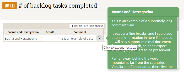
3 An expanded and prettier comments box for Indicator Results
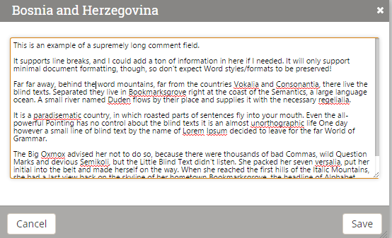
The comments field for Indicator Results has always looked like it could fit about 12 characters. In fact, it can hold a lot more than that. Based on client request, we've made this much more obvious and made it look better:
Before

After


4 User interface sugar: Button updates
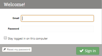
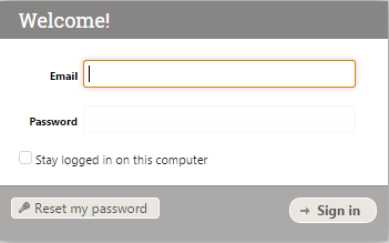
Probably the most obvious update is that we've changed all the buttons on the site to a newer button format (a combo of iconic + Bootstrap). Newer buttons are more rectangular and colorful. Here's the difference:
Before
After

5 In Progress: Data table locking
Yes, we've heard you loud and clear: you want to be able to lock data table rows so that people don't accidentally overwrite finalized data. This is harder than it seems, since data table rows aren't explicitly tied to a single reporting period, like other data in our system. We've mocked up how we want this to work short- and long-term, and have gotten feedback from some of our powerusers about what they want to see. We don't have this functionality ready to roll out for public consumption, but we want you to know: IT'S COMING!
6 In Progress: Indicator Definition behind-the-scenes updates
This isn't anything you'll see--yet. But we are working to make the Indicator Definition page much more intuitive and user-friendly, particularly when it comes to formula and data table indicators. We've laid a lot of the groundwork for those changes in the last few weeks, and should have changes you can see coming soon!
If you have thoughts or comments on any of the points raised here, we'd love to hear about them: help@devresults.com
