We are pleased to announce the first of our major visualization overhauls: the new Indicator Targets vs. Actuals Graph.
What It Gives You
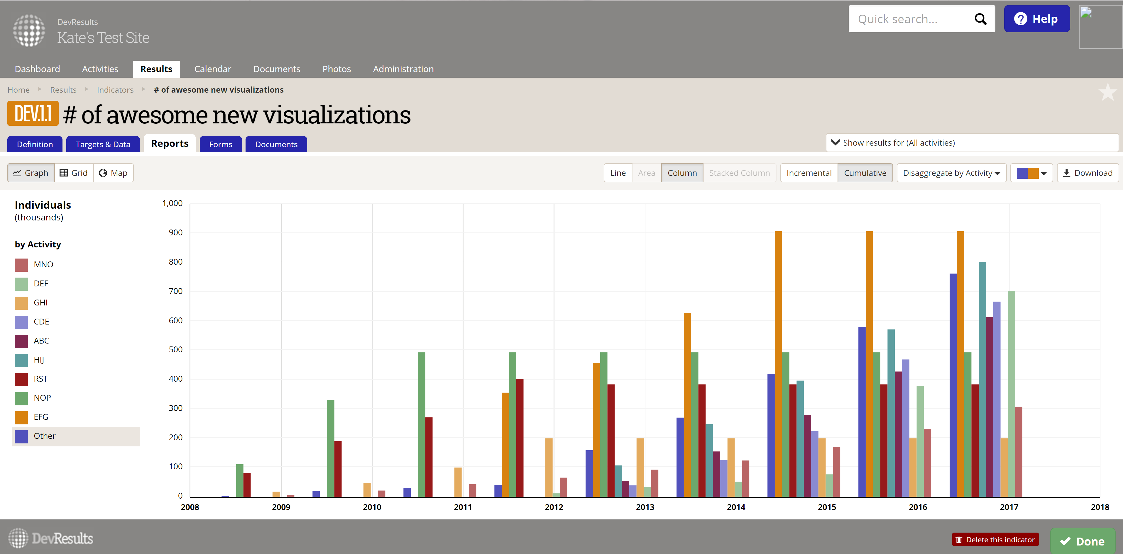
The new visualization unleashes all kinds of new functionality, including:
- Depending on the indicator's configuration, you can choose from one of four graph types:
- Line (like the old visualization)
- Area
- Column
- Stacked Column
- You can choose whether to display data incrementally or cumulatively.
- You can choose to display data disaggregated by:
- Activity
- Geography (such as district, governorate, etc.)
- Any other assigned disaggregation!
- You can choose from a handful of different color palettes.
- If you have data in multiple reporting cycles, you can choose which reporting cycle to display data for.
- You can now download the visualization and its legend.
- Hovering over any data point gives you full details on the reporting period it comes from.
- The axes will resize if you resize your browser window.
- The Y axis is labeled with the indicator's Unit.
How Do I Use It?
Open any indicator in your DevResults site and click the Reports tab. Click the Graph button in the upper left if the visualization doesn't automatically open. And have fun!
A Thank You for Beta Testers
We officially started our beta testing program earlier this year. The Targets vs. Actuals Graph is the second new feature we've asked our beta testers to help with, and we have been amazed at the caliber and detail of feedback you provided! You helped us find a few bugs, gave us all kinds of positive feedback on what you liked, and suggested awesome future improvements.
We know how busy you are and we are humbled and amazed at how much time you took to put this feature through its paces. So: THANK YOU. This visualization--and DevResults--are better because of you. (Seriously. I would bake you cookies if I could.)
If you'd like to join our elite group of DevResults beta testers, go to your DevResults profile and check the box next to I would like to be a beta tester.
Where Our Viz Is Going
With the release of the new Targets vs. Actuals Graph, we've laid the groundwork for all future visualizations in DevResults. This work has been informed by a few key considerations:
- Reusability: In the past, each visualization had a totally different set of configuration options and logic. Instead, we've now built a common architecture and toolset that all further visualizations will use, making it easier for us to roll out improvements to all visualizations simultaneously.
- Consistency: Our previous visualizations all had to do math and logic independently. The new architecture lets us wire all this logic together so that you can easily and quickly toggle between different visualization types.
- Responsiveness: In the past, most of those calculations were performed server-side, so any change to the configuration or display had to wait for the server to adjust and re-send things. The new architecture--in keeping with our larger architectural efforts--does most of its work in your browser. The end result: faster, more responsive visualization.
What's Next
Over the course of 2017, you can expect a lot more visualization improvements from DevResults, fully replacing older visualizations with newer, faster, and more interactive versions with additional filters and configuration options.
Next on visualization overhauls, we'll be updating the Indicator Choropleth Map and the Dashboard/widgets!