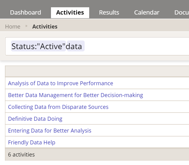
We're proud to announce the unveiling of our new, improved Index pages. These are the pages that list all of your activities, all of your indicators, etc. We completely rewrote these from scratch to get you improved performance, a cleaner interface, and a whole bunch of perks. The new pages are considerably faster, the filters/search are much more responsive and user-friendly, you can now create new activities in bulk, and you can treat filtered index pages as saved reports. Here's a full list of the improvements:
Why the changes?
We are gradually changing all of DevResults' pages to use Angular to improve page load times and overall performance, and we're taking this opportunity to streamline the user experience and make everything better, faster, and easier. The Index pages were a key target for us because they have had some of the slowest load times, particularly if you're tracking hundreds or thousands of activities or indicators.
Which pages changed?
- The Activities index (accessed via Activities from the top navigation menu)
- The Indicators index (accessed via Results->Indicators)
- The Locations index (accessed via Administration->Locations)
- The Organizations index (accessed via Administration->Organizations)
- The Groups index (accessed via Administration->Groups)
Here's what you need to know about the new, improved pages:
1 Pages will load much faster
The changes we made make index pages--even those with hundreds or thousands of indicators or activities--load much faster. You'll notice these improvements in two ways:
- The first time you visit an index page during a browser session, it loads much faster than before--about 4 times faster during our tests!
- On subsequent visits to the page during the same browser session, it loads almost instantly.
- Filters, searches, and sort order changes will also load almost instantly.
2 New Filter/Search and overall layout
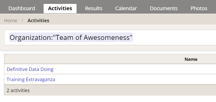
The first difference you'll probably notice is that the entire left-hand set of filters and search bars is gone. In its place, there's a simple Search bar at the top. But never fear--we haven't gotten rid of the filters! If you click in the Search box, you'll see all the available filters. So, for example, here are the filters for the Activities index:
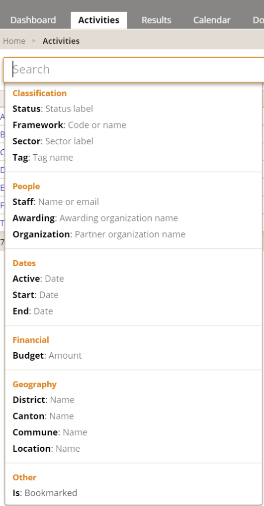
- Start typing the text of the filter label
- Click on any of the filter labels to select it
- Use your keyboard down arrow + Enter to select one of them and then type in the text you want to search.
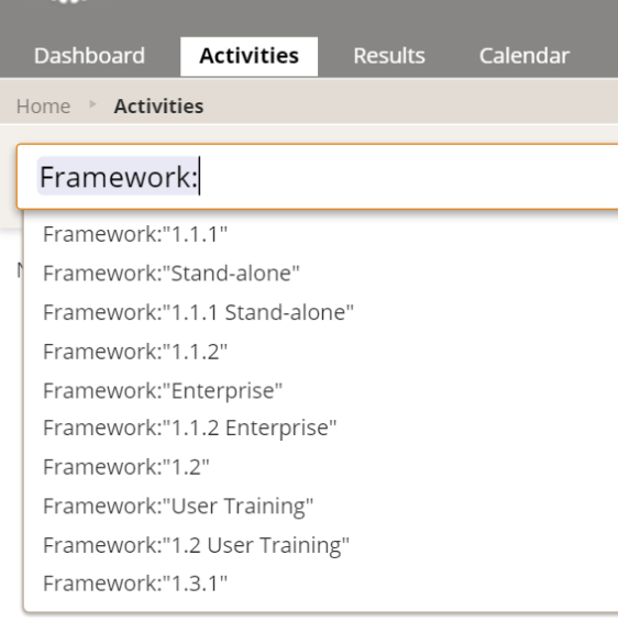
Once you've done any of those, the dropdown will change to provide a list of auto-complete options based on the filter or text you've provided--type it, click it, or arrow and enter to select what you need:
Pro Tip: The search box will also handle a freeform text search:
And you can add that text search at the end of a normal filter:
3 Use your index filter/search settings like a shared report
One of my favorite features of the new filter/search layout is that all of your terms, filters, sort order, and visible column settings are appended to the url, so you can actually set up the index how you want, copy the url, and either bookmark that url for your own use, or give it to someone else as if it's a shared report. This makes it quite easy to ensure everyone in a meeting is looking at the same list, and it can save you time from having to frequently set up the same filters, columns, etc.
4 Smarter exports
Three of these index pages (Activities, Indicators, and Locations) had an export function before, but it would export every column you could possibly have on the page. The other two (Organizations and Groups) had no export function. We've made exports smarter in a couple ways:
- Now, the Activities, Indicators, Locations, and Organizations indexes all support exports. You can find this option by clicking the cog button in the upper right of the page:
- What you see is what you get: The exports will only include the columns you're currently viewing in the index.
5 Import Activities and other items IN BULK!
You can now import Activities, Organizations, and Locations in bulk! There are a few limitations and we're still working on an Indicators import, but for those of you who have been manually entering new Activities or Organizations one at a time, please check this feature out!
Imports will never delete existing data; they can either update existing items (those that have a valid ID in the relevant ID column), or they will create new items (those that have a blank ID). Here are the steps you'll need to follow for a bulk import:
- Click the cog button in the upper right and Export a template to use as an example.
- Add the rows you'd like added and/or make edits to the existing rows, and save your Excel file. Rows with an existing ID will update the existing records; rows with a blank ID will be created as new records.
- Click the cog button in the upper right and select Import.
- The system will prompt you for the file to import--you can drag it into the box or you can click to browse and navigate to it.
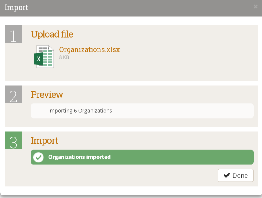
- Once you've added your file, the system will perform some checks to verify it can upload what you've added. It will give you warning errors if it can't; otherwise, it will confirm the number of new items it will create.
- You'll get confirmation once it's complete:
6 No more banners: More rows per screen
I'm sure you noticed it right away: the colored banner summarizing the activities, etc., is no longer at the top of the page. While it makes the page a little less colorful, we know a lot of our users access the site on small laptops, and the banner was taking up a lot of room. We removed it in favor of giving you more screen real estate to see the info that matters most to you. The summary information we had there (# of items displayed, etc.) is now displayed in a summary row at the bottom of the display grid.
7 Clickable links
In the old index pages, you had to click on an item to open it, and it opened in the same window, and you had no control over this. Where appropriate, we've made all the items in the index (activities, indicators, etc.) hyperlinked so that you can right-click on them and open in a new window or tab while leaving the index page alone. If you ever want to compare three indicators side-by-side, this will be a little faster for you to get all three opened!
Over the next few months, we'll continue to make small improvements to these pages (including adding a bulk import for Indicators), so if you have suggestions, please email us if you have any questions or feedback on the new index pages!

