A blog post for anyone who writes indicators
Contents:
- Percentages
- Percent Change
- Cumulative vs. Incremental Targets
- Cumulative vs. Incremental Actuals
- Disaggregation vs. Free Response
- Cross-Disaggregation vs. Parallel Disaggregation
- Deduplication
Background
In seven years as a data scientist at DevResults, I’ve worked with donor agencies, implementing partners, nonprofits, and private companies. I’ve had a front-row seat to M&E planning in the sectors of health and sanitation, education, democracy and government, humanitarian response, justice and law enforcement, agriculture, and economic growth. In that time, I’ve seen many indicators that were mathematically incorrect or fatally vague. Indicators get mangled in bureaucratic processes and often poorly reflect the original intent. This post will cover the most common problems I’ve encountered — problems that originate with the way indicators are defined and the way tools are set up to track results.
1. Percentages
Take a humble percentage indicator: Percent of people who passed a test. This is calculated as:
People who passed the test ➗ People who took the test
If 1 person passed out of 2 who took it, 50% passed. Simple enough. The problem arises when comparing results between different disaggregations, places, projects, or time periods.
Consider the example below, where many more people took the test in location B than A. If implementers report 50% and 99% for these locations, you might average them to get 74.5%. But this is clearly false. In total, 100 passed out of 102 who took it. This is a 98% pass rate. The only way to get to the correct result is to collect the numerator and denominator separately, NOT the percentage. You can always calculate the percentage yourself across disaggregations, places, projects, or time periods that you’d like to analyze.
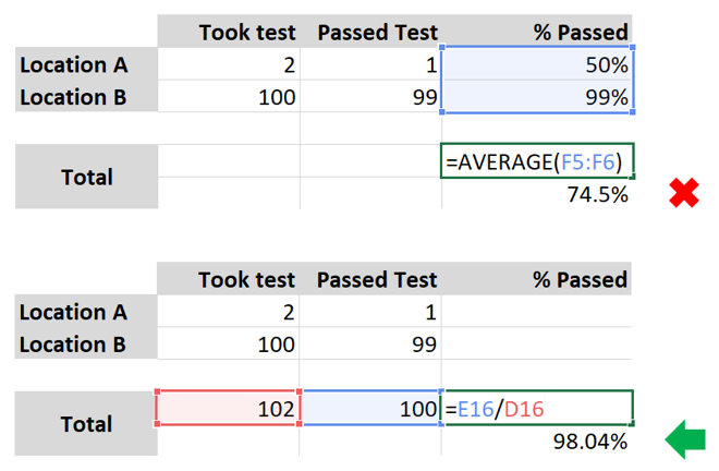
Put another way, taking an average of percentages is always incorrect where denominators vary.
If you write indicators, you should require that the numerator and denominator are reported separately. If you're not in the position of writing indicators, it's always good practice to keep track of your numerator and denominator separately, even if you’re not required to.
Percentages are analysis done on data, not the data itself.
2. Percent Change
Calculating percent change presents the same challenges as described above: any aggregation of percent change would be incorrect if collected on its own. Instead, percent change should be calculated using underlying data for the two time periods to be compared. This is the same math as above.
But percent change offers additional pitfalls. Percent change from what? Here are a few options for change analysis with dramatically different results:
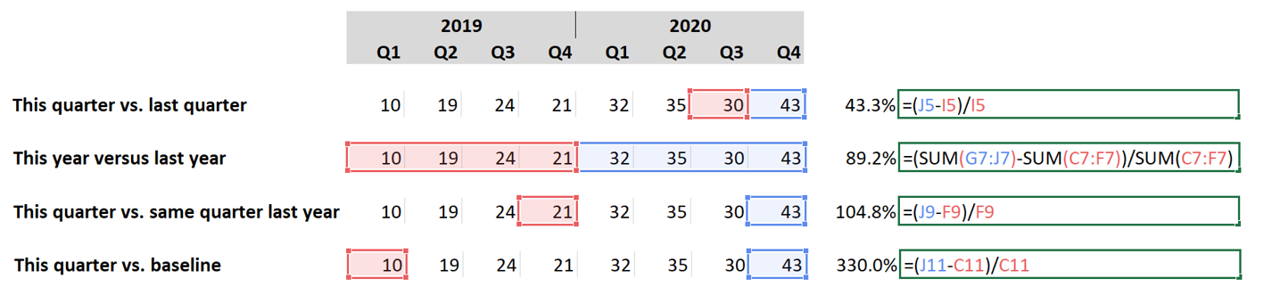
Each of these percentages is valid, but each means something completely different. Our advice is to collect the underlying data, enabling any of these kinds of analysis.
Good indicator: # fuel-efficient cookstoves in use
Resulting analysis: % increase in fuel-efficient cookstoves
If you use the first indicator:
- You can aggregate current and former data before calculating percent change, ensuring accuracy.
- You can always compare current data to any previous data.
If you don’t use the first indicator and only have people report their analysis:
- Comparisons across projects and places will be necessarily incorrect. They won’t be properly weighted by the number of cookstoves previously in use in different places or different projects.
- A location going from 1 to 2 cookstoves would have a 100% improvement, while a location going from 2 to 3 would have a 50% improvement. If the only data you have are the percentages, they seem very different, even though these results are nearly the same.
In short, percent change is analysis done on data, not the data itself.
3. Cumulative vs. Incremental Targets
Some organizations and projects think of targets as “This is what should be accomplished from the start of the project up to this date.” We call those cumulative. Some organizations and projects think of targets as “This is what should be accomplished only during this reporting period”. We call those incremental. Each is equally valid, but to avoid major problems in interpreting progress to target, the choice must be clear.
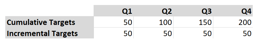
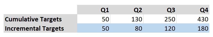
In the example below, the cumulative and incremental options are mathematically equivalent.
- For the cumulative row, there should be 50 things done by the end of Q1, then another 50 by the end of Q2 for a total of 100, and so on.
- In the incremental row, it’s simply stating that 50 things should be done each quarter. Both mean that 200 things should be done during the year.
Without the labels, you’d probably intuitively understand what each row meant.
But take the example here. Are these cumulative or incremental?

They could be either. If you interpreted them as cumulative, the goal would be to do 180 things by the end of the year:
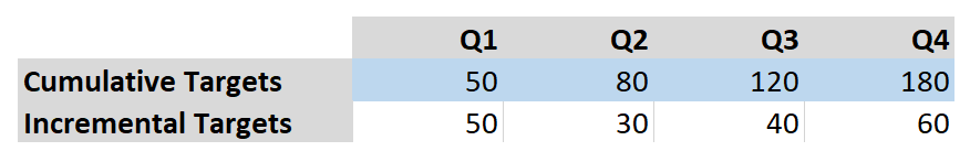
But those targets could also be interpreted as incremental. In this case, the goal would be to do 180 things in the last quarter alone. The goal for the whole year would be 430:
If you assign targets, make sure you identify whether each indicator’s targets are cumulative or incremental. Each is equally valid, but if not clearly defined, analysis of progress to target could be dramatically wrong. If you're not assigning targets, it's always worth clarifying whether the targets you're working toward are cumulative or incremental.
4. Cumulative vs. Incremental Actuals
The meaning of cumulative vs. incremental for actuals is the same as for targets, but the considerations for handling actuals is different. In this case, the question is not how to interpret written targets, but how to enter the data requested. Whether or not indicator results should be recorded incrementally or cumulatively is dictated by the indicator definition.
In this respect, there are two kinds of indicators — those that measure work done over a period of time, and those that observe a state at a point in time.
Measurements of work done:
# schools built
# kilometers of roads cleared
# vaccinations administered
Observations:
# schools in community
# kilometers of clear roads
# community members who are vaccinated
Measurements of work done should be reported incrementally. Each reporting period, implementers should report just what work was done since the end of the last reporting period.
In contrast, observations are necessarily cumulative. At the end of a reporting period, you report the state of affairs at that moment.
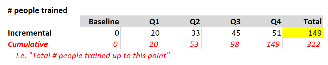
Consider the indicator # people trained. Training someone is “work done” during a certain time period, so it should be reported incrementally. Features of “work done”, or incremental indicators:
- The baseline is zero. Before you train anyone, you’ve trained 0 people.
- A sum of all the reported data gives you the total (see below in yellow).
If you really want to report this data cumulatively, then the indicator should be named clearly (see in red), but it’s inadvisable. It just makes it harder to analyze things like change over time and the total is meaningless. How many people were trained in the second half of the year? That’s easy if you look at the incremental data, but less intuitive looking at the cumulative data. (96).
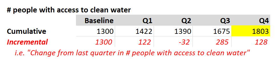
Now consider the indicator # people with access to clean water. Handling this data cumulatively is straightforward -- you just report who has clean water at the end of the quarter. Features of “observations”, or cumulative indicators:
- The baseline is most often not zero. There will likely be some people with access to clean water prior to a program’s efforts.
- Cumulative data should never be added together. Any sum or total is meaningless. The end result is simply the last datapoint entered (yellow).
If you really want to report this data incrementally, then the indicator should be named clearly (see in red), but it’s inadvisable. Here, Q2 ended with fewer folks with access to clean water than in Q1. This is easy to read in the cumulative row. But a “-32” as an incremental change makes less intuitive sense.
If you write indicators, make sure the indicator name explains whether the data is incremental or cumulative. It should be clear whether someone is measuring work done or making a point-in-time observation.
5. Disaggregation vs. Free Response
Two pieces of information are required for defining a disaggregation.
- The disaggregation, such as sex.
- The disaggregation categories, such as male, female.
No disaggregation is complete without its set of disaggregation categories. If you want to disaggregate by age groups, what are the age groups? If you want to disaggregate by training type, what are the training types? Defining this information is required for any indicator definition.
Occasionally I talk to a project that plans to offer a free response option in a survey. The project wants to learn from beneficiaries what the categories should be (what type of fertilizer do you use?), or to hear what beneficiaries have to say in their own words (how do you feel about your local police?). The project doesn’t want to pre-suppose a narrow set of potential options to choose from. This is a perfectly valid survey method, but writing surveys is not the same thing as writing indicators. Disaggregating indicator results means taking each response/event/observation and putting it into a bucket; the bucket is the disaggregation category. You simply can’t put something in a bucket if the bucket doesn’t exist.
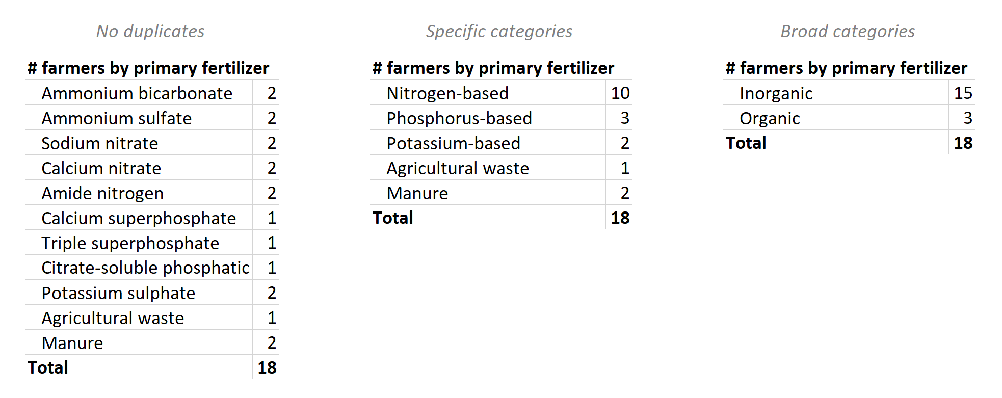
Take this set of survey responses. To a computer, all 18 responses are different. If you made a report disaggregated by fertilizer, you’d just have a list of every response with a count of “1”. This isn’t very useful for summarizing large datasets. If you consider all the differences in terminology (and spelling!) then 1000 people could give 1000 different responses. Listing them doesn’t equal disaggregation.
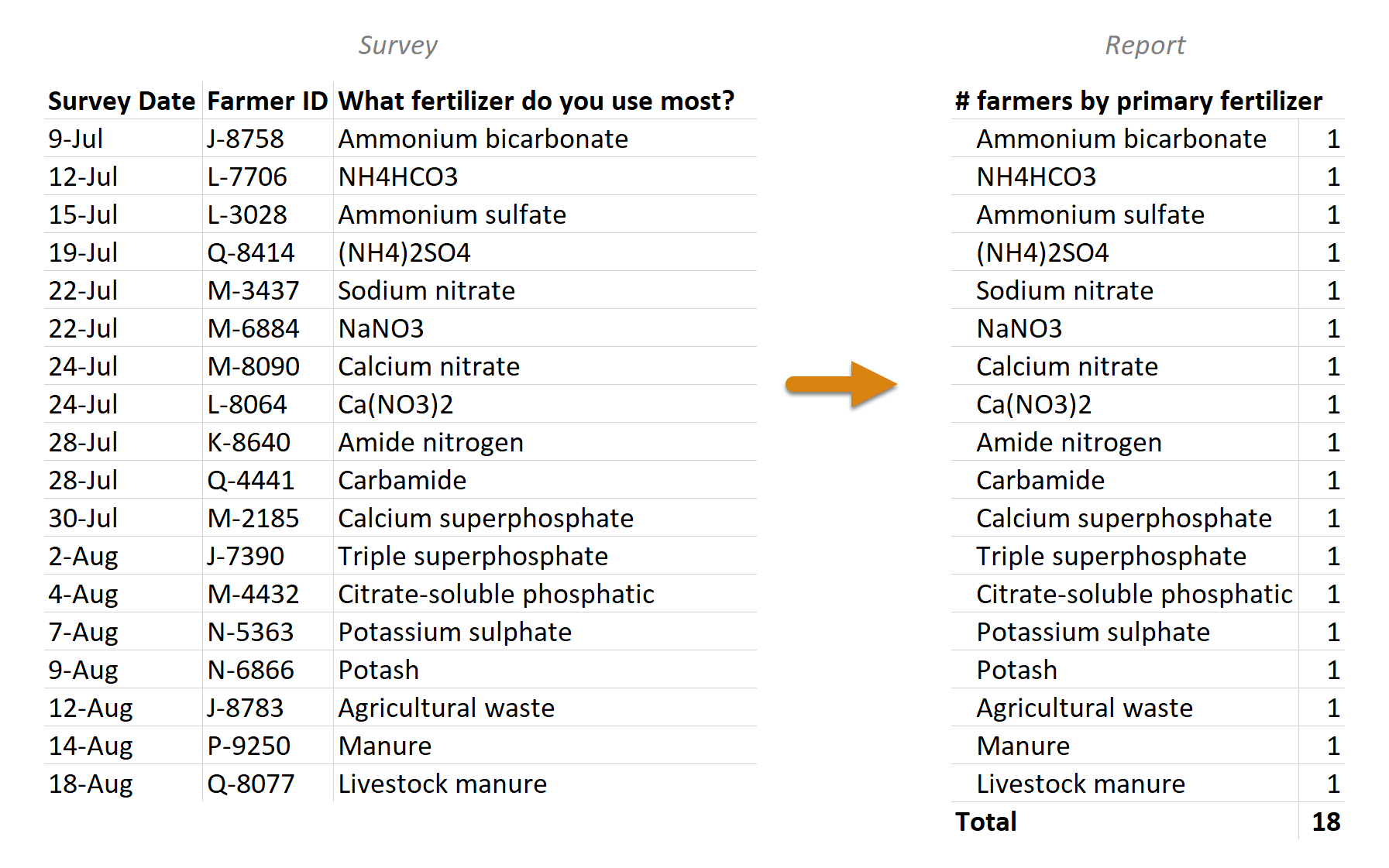
If you start with a list of free responses, you have to decide how to group them -- that is, what the disaggregation categories should be. There’s rarely one right answer for how to do this. In our example, you could simply remove the duplicates/synonyms, or group them with various levels of specificity.
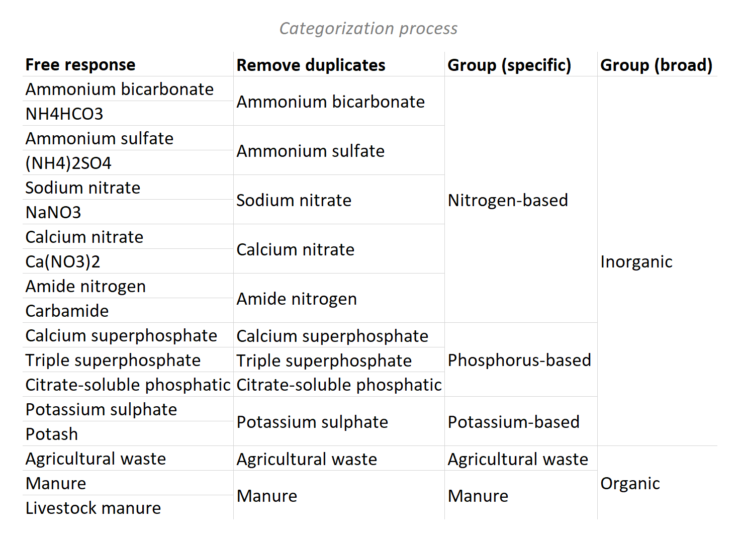
The choice in how the responses are categorized can produce a range of results. Regardless, no result is possible without first settling on a finite set of disaggregation categories, thus completing the indicator definition.
Categorizing free responses can be laborious and can introduce the biases of the person doing the sorting, but it can also provide unexpected insights and avoid presumptions of an indicator-writer. It really depends on what you need the data for. If the goal is simply to understand the prevalence of inorganic vs. organic fertilization, you could skip the free response and go with multiple choice.
All the same warnings apply to offering a category like “Other (please specify)”. That’s a free-response list within a multiple-choice answer. It would be subject to the same requirements that the data be cleaned and grouped by meaningful categories. The same would even be true of a survey that invites paragraph-length narrative responses.
To indicator writers: indicator definitions are not complete until disaggregation categories are finalized. If disaggregation categories won’t be determined until after a free-response survey is given, make sure there is a process in place for defining them then.
6. Cross-Disaggregation vs. Parallel Disaggregation
Frequently, indicators have multiple disaggregations, each with their own set of disaggregation categories. In these scenarios, data can either be reported for category combinations (cross-disaggregated) or for each category in isolation (parallel-disaggregated).
Consider disaggregation by sex and age. With cross-disaggregation, each sex category is subdivided by all of the age categories. In this scenario, adding up all the results gives us the total number of teachers:
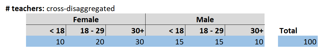
Since we have one disaggregation with two categories and one with three, the total possible combinations is 2 x 3 = 6. Imagine if you wanted to disaggregate by sex (2 categories), age (3 categories), training type (5 types), course level (4 levels), and location (10 places). That would be 2 x 3 x 5 x 4 x 10 = 1,200 combined categories. If you write indicators, be aware of the multiplication effect with heavily cross-disaggregated indicators. If such specificity is even warranted, make sure implementers have the resources they need for handling this quantity of data.
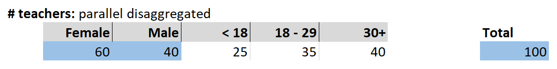
In contrast, with parallel disaggregation, the sex and age categories are handled separately. In this version, we don’t know how many females are under 18, or how many 30+ folks are male. The categories are not subdivided. With parallel disaggregation, our total number of teachers comes from just adding the females and males together. This has the benefit of reducing the reporting requirements but there’s a loss of specificity in the information.
An alternative use of parallel disaggregation is the case where the second disaggregation is not mutually exclusive. For example, you could vaccinate 100 people and give all 100 each vaccination:

This gives us information about how many people were vaccinated and the vaccinations received. Since we’re counting people, it would be meaningless to add up the vaccination counts to get 300. (That would be a different indicator, # vaccinations administered). Parallel disaggregation gives us the option to mix mutually exclusive and non-mutually exclusive categories, which is impossible with cross-disaggregation.
If you write indicators, make sure that indicators with multiple disaggregations are clearly defined as cross-disaggregated vs. parallel disaggregated. For cross-disaggregation, be especially aware of the number of potential category combinations.
7. Deduplication
Now the fun starts. Instead of numerical data, consider the raw records that they come from. Imagine keeping this log of trainees:
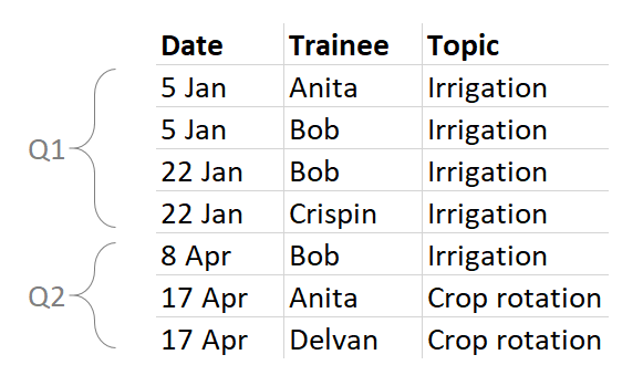
It’s very common for programs to be interested in deduplicated — or “unique” — counts of trainees or other beneficiaries. But this can be much more complicated than it sounds. First, let’s look at three ways of calculating a deduplicated count of trainees.
In the most basic sense, 4 people were trained: Anita, Bob, Crispin, and Delvan.

However, what happens when we report a unique count each quarter? Anita, Bob, and Cripin were trained in Q1, while Anita, Bob, and Delvan were trained in Q2. It would make perfect sense for an implementer to report Q1: 3 and Q2: 3. The problem is that the total would be 6, even though we know that only four people are involved.

Are you expecting to receive a report that says Q1: 3, Q2: 3, Total: 4? If so, you’ll need a tool that can handle such complexity. If you don’t have a tool that does that, then it’s better to handle quarterly unique counts as separate indicators from all-time unique counts.
But there’s another way to think of a unique/deduplicated count that leaves a lot less room for confusion. You could define the indicator as a count of the first time someone was trained. This necessarily removes duplicates and simplifies the math for totals.

Both “count unique per quarter” and “count first appearance” are valid strategies, but they produce different results. If you write indicators, you should make it impossible to misunderstand which type of count you’re looking for.
The same complexity arises with disaggregations. Let’s look at the table again:

How many people were trained in irrigation? Anita, Bob, and Crispin: 3. And Crop rotation? Anita and Delvan: 2.
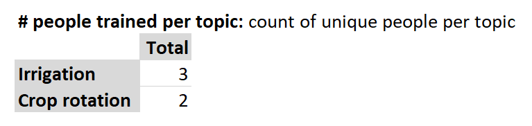
So what’s the sum? Is it 5? Or is it the 4 actual people? Put another way, how do you feel about counting Anita twice since she was trained on two different topics? There’s no right answer, but implementers require clarity, tools, and guidance to arrive at the result you want.
Things only get more complicated when you combine the disaggregations you’re investigating, such as “per topic” and “per quarter”. In this example, the crop rotation total comes out matching the unique count above (2 people), but the irrigation total is different because we’re counting Bob twice, once in each quarter.
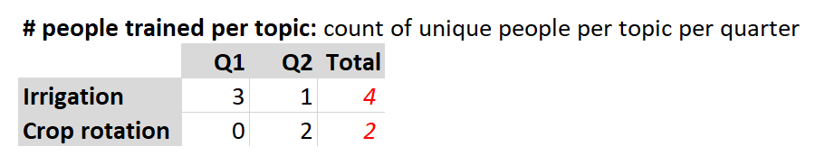
Since only three separate people were actually trained on irrigation, should the total be 3 or 4? Again, are you OK with counting Bob twice since he was trained on irrigation during two different quarters? If not, then the quarterly unique counts should probably be a separate indicator from the overall unique counts.
Compound units offer an opportunity to clarify unique counts. The most common compound unit is the “person-hour”. If 2 people work 5 hours, that’s 10 person-hours. If 1 person works 10 hours, that’s also 10 person-hours. The same logic applies to a deduplicated count of “person-topics”. Applied to our sample dataset, we get 5 unique person-topics. This takes the 7 rows of the table, disregards the second and third time that Bob was trained in irrigation, and gives us a result of 5. This value doesn’t tell us exactly how many separate individuals were involved (since Anita is counted for each topic), but it “gives credit” for every time a person was exposed to a new topic.

Another way to “give credit” would be to count person-trainings. In this case, the project would get credit for training Bob 3 times on the same topic.

With almost every organization I’ve ever worked with, there’s been a conversation along the lines of, “if you train Bob twice, do you count him twice? What if you train him in separate reporting periods? What if you train him on different topics?” It’s rare that people are sure of the answers or that everyone agrees. If you write indicators, the answers to these questions should be explicit. Here, we’re counting a tiny dataset by eye. It’s extremely complicated to use Excel for something like “count first”, or to “count unique per quarter but with an all-time unique total”. If you have a voice in choosing indicators for projects, ensure that they have the tools and know-how to produce accurate results.
Contact Us
If you’d like to learn about how our tools and expertise could help your organization, or if you’d just like to talk more about indicators, please don’t hesitate to reach out to us at info@devresults.com.